
Complete Toolkit
Includes components, blocks, UI kits, boilerplates, templates, and design systems for rapid project launch.
Compatibility
All components are compatible with shadcn/ui CLI, ensuring a seamless integration.
Customizability
UI kits are fully themable and easy to customize, allowing for unique designs.
Open Source
Core components are free and public, promoting community involvement and support.
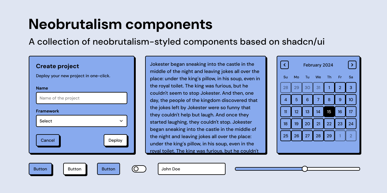
The shadcn/ui registry is an extensive platform designed for developers and designers, featuring a comprehensive collection of UI components tailored for React applications. This registry allows users to pick, generate, mix, and build components that suit their projects, ensuring that they have access to modern UI tools and patterns. With a focus on usability and aesthetics, the components support smooth animations and are built using industry-standard technologies like React, Typescript, and Tailwind.
The registry includes various UI kits designed with modern aesthetics and practical UX patterns, all crafted to facilitate the fast development of impressive interfaces. It also offers a library that will continuously expand with new components and pre-built blocks, ensuring that users remain at the cutting edge of UI design.
Building modern web applications with complex interfaces.
Creating responsive and visually appealing UI components quickly.
Integrating advanced animations and design systems into projects.
Core components and UI blocks are available for free and can be used in personal or commercial projects.
The initial goal is to release at least 8 UI Kits by Q3 2025.
A UI Kit is a complete design system that includes a recreation of shadcn/ui components along with additional elements, crafted with precision.