A time picker component for your shadcn ui app
DateTime Selection
Easily pick and manipulate date and time values.
Keyboard Navigation
Supports keydown events and arrow navigation for improved accessibility.
Mobile Optimization
Optimizes the keyboard experience for mobile users.
No Additional Library Required
Lightweight and simple integration without the need for extra dependencies.
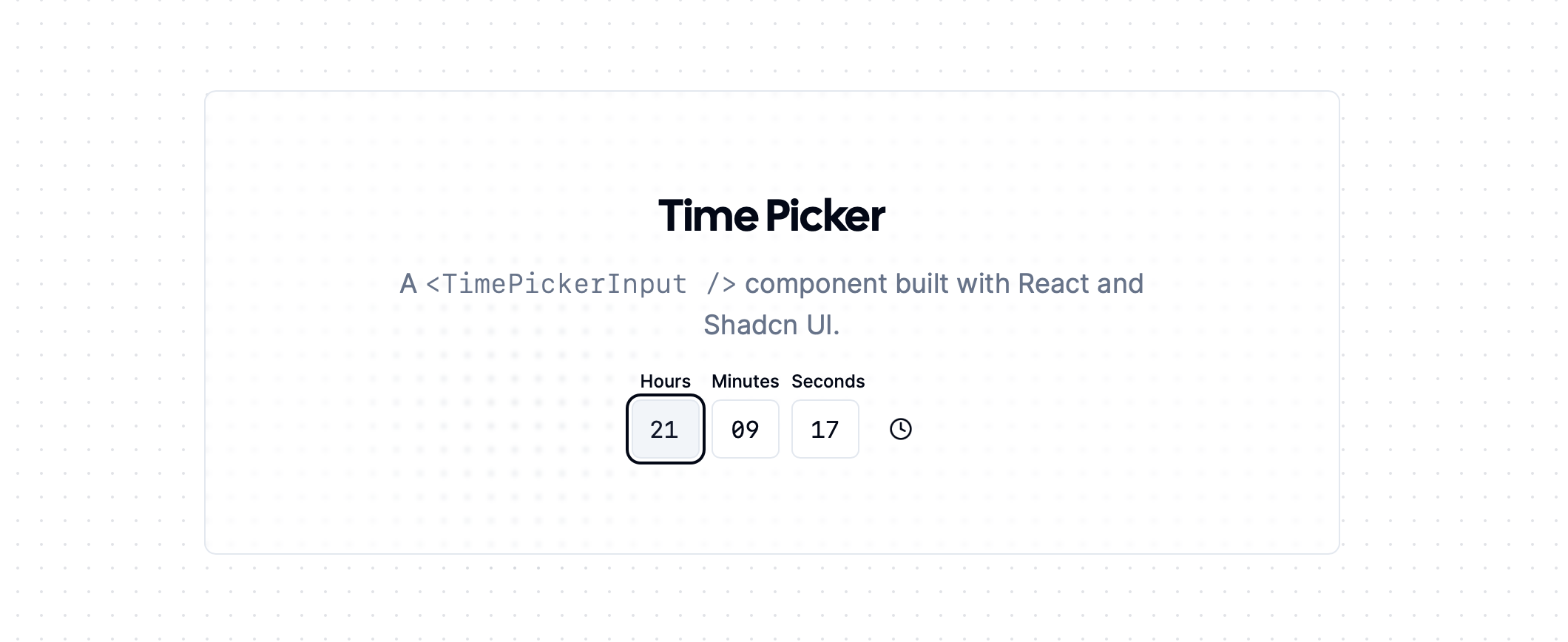
The TimePicker component is built with React and Shadcn UI, allowing developers to incorporate a user-friendly time selection tool into their applications. It supports various time formats, including twelve-hour clocks, and provides a clean interface for users to select hours, minutes, and seconds. The component listens to keydown events for efficient navigation, making it accessible for all users.
The component includes snippets for demo implementations, such as time-picker-demo.tsx and time-picker-input.tsx. It also requires the shadcn/ui package, which includes necessary components like the Input and Select.
Creating appointment scheduling applications.
Building time-sensitive reminders or notifications.
Developing user interfaces that require time input for events.
You can install it by including shadcn/ui and copying the necessary component files.
Yes, the TimePicker is optimized for mobile keyboards.
Yes, the component supports various time formats including both twelve-hour and twenty-four-hour clocks.