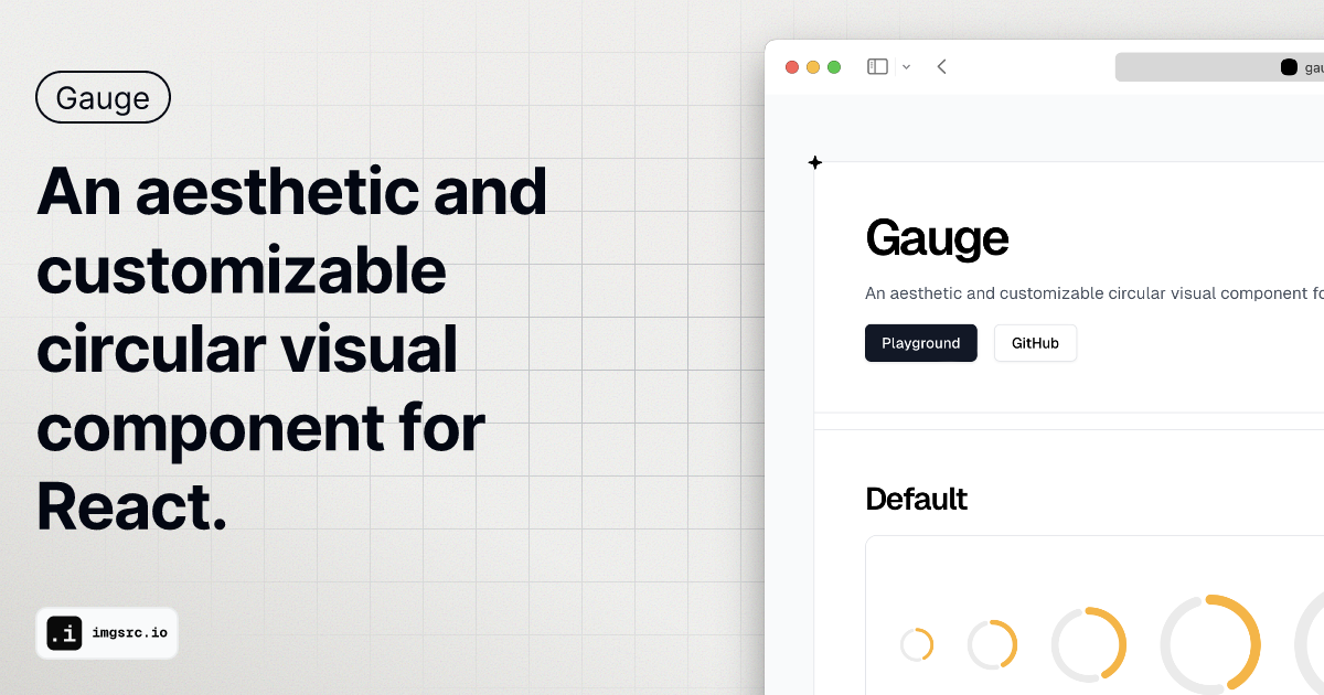
An aesthetic and customizable circular visual component for React.
Label Display
Display the value inside the Gauge with the showValue prop.
Variant Options
Choose between ascending and descending variants to track goals achieved or remaining.
Animation
Animate the Gauge on initial render to enhance visual appeal.
Customizable Colors
Easily customize primary and secondary colors to match your design.
Gauge is a versatile and visually appealing circular component designed for use with React applications. It allows developers to create dynamic visual representations of data in an engaging way. The component includes several features that enhance its usability, such as customizable size, color, and display options. With its smooth animations and flexible configurations, Gauge is perfect for tracking progress, performance, or any metric that benefits from a visual representation.
The Gauge component offers options for size, gap percentage, stroke width, and color customization. It supports npm, yarn, pnpm, and bun for easy installation.
Tracking project completion percentages
Displaying performance metrics in dashboards
Visualizing goal achievements in user interfaces
You can install Gauge using npm, yarn, pnpm, or bun with the command: npm install @suyalcinkaya/gauge.
Yes, Gauge allows you to customize both primary and secondary colors.
Yes, the Gauge can animate from 0 to the value for ascending variants and from 100 to the value for descending variants on initial render.