Ready-made responsive modal component for shadcn/ui.
Responsive Design
Adapts to different screen sizes with the use of Dialog and Drawer components.
Easy Installation
Can be added to projects with a simple command using npx.
Customizable Components
Includes various customizable components such as Header, Footer, and Body.
State Management
Allows for modal visibility to be controlled via state.
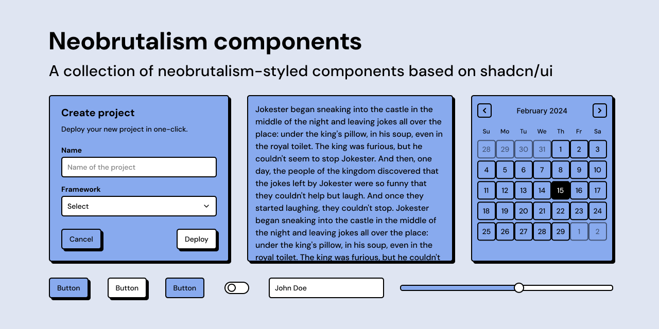
Credenza is a responsive modal component designed for use with shadcn/ui, providing a versatile interface for displaying content in a modal or drawer format based on the screen size. It leverages the Dialog and Drawer components and is built on top of the Vaul library, ensuring a seamless user experience across devices.
The Credenza component includes various sub-components such as CredenzaTrigger, CredenzaClose, CredenzaContent, CredenzaDescription, CredenzaHeader, CredenzaTitle, CredenzaBody, and CredenzaFooter, allowing for a structured approach to modal content management.
Displaying important messages to users in a modal format.
Presenting forms or interactive content that requires user input.
Creating an accessible interface for navigation menus on smaller screens.
You can install Credenza by running 'npx shadcn@latest add dialog drawer'.
Yes, you can customize the modal’s components using props and CSS classes.
Yes, Credenza is designed to be responsive and works well on both desktop and mobile devices.